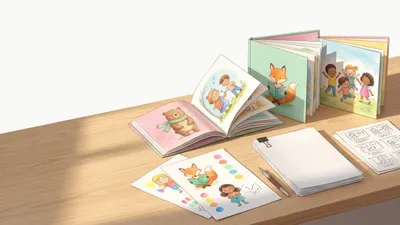
Your book cover is the first thing potential readers see — and often the only thing that determines whether they click on your book or scroll past it. In online bookstores, where most book purchases now happen, your cover is a thumbnail roughly 100 pixels wide. If it does not work at that size, it does not work.
A great cover communicates three things instantly: genre, tone, and professionalism. Get those right, and your book earns a closer look.
Why Book Covers Matter More Than You Think
Authors spend months or years writing their books, then spend hours on their covers. This is backwards. Your cover is your most important marketing asset — more important than your book description, more important than your author bio, and arguably more important than your first chapter when it comes to generating sales.
Readers judge books by their covers. According to a survey by The Codex Group reported in Publishers Weekly, cover design is the number one factor influencing book purchase decisions for browsing readers — ahead of author name, price, and description.
Online bookstores amplify this. When readers browse Amazon, they see a grid of thumbnail covers. Your book has roughly two seconds to signal “this is a professional book in the genre you’re looking for.” An amateur cover signals amateur content, fairly or not.
Genre readers are especially cover-sensitive. Romance readers, thriller readers, fantasy readers — they all have trained expectations for what covers in their genre look like. A romance cover that looks like a thriller will not attract romance readers, regardless of the book’s quality.
Genre Conventions You Must Follow
Every genre has visual conventions that readers use as shorthand for “this is the kind of book I’m looking for.” Ignoring these conventions does not make your book stand out — it makes your book invisible.
Romance
- Illustrated characters (the current dominant trend, replacing photography)
- Warm color palettes — pinks, teals, sunset oranges, pastels
- Character poses suggesting the relationship dynamic
- Playful, hand-lettered or modern serif typography
- Light, bright backgrounds for contemporary; richer tones for historical
Current trend: Illustrated covers with stylized characters in scenes have dominated romance since 2020. Photo-based romance covers still work for certain sub-genres (dark romance, romantic suspense) but illustrated covers signal “contemporary romance” to most readers.
Thriller and Suspense
- Dark backgrounds — blacks, deep blues, shadowy grays
- Bold, large typography (often the title is the dominant visual element)
- Minimal imagery — a single object, a silhouette, a stark landscape
- High contrast between text and background
- Red or yellow accent colors for urgency
Key rule: Thriller covers should feel ominous at thumbnail size. If the mood is not immediately dark and tense, the cover is not doing its job.
Literary Fiction
- Minimalist design with conceptual imagery
- Muted, sophisticated color palettes
- Elegant serif typography
- White space used intentionally
- Abstract or symbolic imagery rather than literal illustration
Key rule: Literary covers signal “this is a thoughtful reading experience.” They tend to look like they belong on a curated shelf in an independent bookstore.
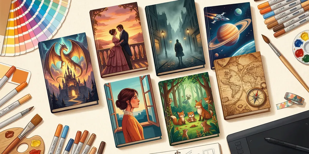
Fantasy and Sci-Fi
- Dramatic, detailed imagery (maps, landscapes, characters, worlds)
- Rich, saturated colors
- Ornate or stylized typography that matches the sub-genre
- Epic scope suggested through composition
- Dark backgrounds with luminous focal points
Key rule: Fantasy and sci-fi covers should suggest world-building. The cover promises an immersive experience in a world different from ours.
Nonfiction (Business, Self-Help, How-To)
- Clean, professional layouts
- Bold, readable typography (the title does most of the work)
- Simple color schemes — often two or three colors maximum
- Author name prominent (authority matters in nonfiction)
- Minimal imagery or simple iconic graphics
Key rule: Nonfiction covers sell the promise, not a scene. The title and subtitle do the heavy lifting. The design’s job is to look professional and credible.
Design Principles for Book Covers
These principles apply across all genres. They are not subjective preferences — they are functional requirements for covers that sell books.
Readable at Thumbnail Size
This is the single most important design principle. Open Amazon, search for books in your genre, and look at the results grid. Every title on that page is competing for attention at roughly 100 by 150 pixels.
Test your cover: Shrink it to thumbnail size on your screen. Can you read the title? Can you identify the genre? If not, the cover fails its primary function.
Large, bold typography, high contrast between text and background, and simple compositions survive the thumbnail test. Detailed illustrations, small text, and low-contrast color choices do not.
Clear Title Typography
Your title must be readable before anything else. This means:
- Font size: Larger than you think it needs to be
- Font choice: Clean and genre-appropriate (no Comic Sans, no Papyrus — ever)
- Contrast: Dark text on light backgrounds or light text on dark backgrounds
- Placement: Positioned where it does not compete with background imagery
The best-selling covers in every genre share one trait: you can read the title instantly. According to BookBrush’s design resources, title legibility at thumbnail size is the number one factor in cover click-through rates.
Genre-Appropriate Imagery
Your cover imagery should match reader expectations for your genre. This is not about being formulaic — it is about communicating accurately. A potential reader should be able to identify your book’s genre from the cover alone, without reading the title.
Study the bestseller lists in your genre. Notice what the top 20 covers have in common: color palettes, typography styles, imagery types, composition approaches. Your cover should feel like it belongs in that group — distinctive enough to stand out, similar enough to signal genre.
Professional Typography
Amateur typography is the number one giveaway of a self-published book. Professional covers use:
- Maximum two fonts — one for the title, one for the author name and subtitle
- Proper kerning — letter spacing that looks natural and intentional
- Hierarchy — title largest, subtitle medium, author name appropriate to their recognition level
- No default fonts — Calibri, Arial, and Times New Roman signal “I didn’t hire a designer”
Typography separates professional covers from amateur ones more than any other element. If you can only invest in one aspect of your cover design, invest in typography.
DIY Cover Design Options
If budget is your primary constraint, you can create a serviceable cover yourself — with honest limitations.
Canva
Canva offers book cover templates that produce clean, simple designs. It works best for nonfiction covers where typography does the heavy lifting.
Strengths: Easy to use, free tier available, large template library Limitations: Limited font options, templates can look generic, advanced design features require the paid plan
BookBrush
BookBrush is specifically designed for author marketing materials, including book covers. It has genre-specific templates and mockup generators.
Strengths: Built for book covers, 3D mockup creation, marketing material templates Limitations: Designs can be template-obvious, limited for complex genre covers (fantasy, sci-fi)
Honest Assessment of DIY
DIY covers work for specific situations:
- Nonfiction with text-forward designs
- Limited edition or test covers
- Short stories or series that will be redesigned once they gain traction
DIY covers rarely work for fiction in competitive genres. Romance, thriller, fantasy, and sci-fi readers have trained eyes. A cover that “looks self-published” will cost you sales even if the book is excellent.
Budget Cover Design ($50-$300)
Premade Covers ($50-$200)
Premade covers are professionally designed covers sold on a first-come, first-served basis. A designer creates the cover, and you buy the exclusive right to use it (your title and name are added).
Where to find them:
- The Book Cover Designer
- GoOnWrite
- Individual designers’ premade shops
Pros: Professional quality at a fraction of custom cost, exclusive use, fast turnaround Cons: Limited selection in your exact niche, no customization beyond title and name, popular designs may look similar to other books
Fiverr ($100-$300)
Fiverr has a large marketplace of book cover designers. Quality varies enormously — from excellent to terrible.
How to find good designers on Fiverr:
- Filter by “Level 2 Seller” or “Top Rated Seller”
- Review their portfolio for covers in your genre
- Read buyer reviews carefully (look for repeat clients)
- Start with a small project before committing to a full cover
Budget $150 to $300 for a good Fiverr designer. The $5 to $50 range produces covers that look like they cost $5 to $50.
Professional Cover Design ($300-$1,500+)
For competitive genres — romance, thriller, fantasy, literary fiction — a professional cover designer is the strongest investment you can make in your book’s success.
Where to Find Professional Designers
Reedsy — A curated marketplace of vetted publishing professionals. Designers on Reedsy have traditional publishing experience and portfolios you can evaluate. Prices typically range from $500 to $1,500.
99designs — A contest-based platform where multiple designers submit concepts and you choose the winner. You see multiple options before committing. Prices start around $300 for a basic package.
Genre-specific designers — Many successful cover designers specialize in specific genres and have dedicated followings in the indie publishing community. Search for “best [genre] book cover designer” to find designers whose work you admire. Ask other authors in your genre for recommendations.
What to Provide Your Designer
A good cover design starts with a good brief. Provide:
- Genre and sub-genre — Be specific (“contemporary small-town romance” not just “romance”)
- Target audience — Age, reading preferences, where they discover books
- Comp book covers — Three to five covers in your genre that capture the look and feel you want
- Mood and tone — Dark and tense? Bright and playful? Elegant and literary?
- Title, subtitle, author name — Final versions, correctly spelled
- Book description — A brief summary so the designer understands the content
- Any must-have elements — Specific imagery, color requirements, series branding
- What you do NOT want — Styles, colors, or imagery to avoid
The more specific your brief, the closer the first draft will be to your vision. Vague briefs produce vague designs and more revision rounds.
Common Book Cover Mistakes
Too busy. Cramming multiple images, textures, fonts, and effects into one cover creates visual noise. At thumbnail size, busy covers become illegible blobs. Simple, focused designs win.
Amateur fonts. Papyrus, Comic Sans, Bleeding Cowboys, and default system fonts immediately mark a cover as self-published. Invest in professional typography or hire a designer who uses professional font libraries.
Wrong genre signals. A bright, illustrated cover on a dark thriller. A minimalist literary cover on an epic fantasy. A playful font on a serious nonfiction business book. Mismatched genre signals confuse readers and kill click-through rates.
Author name too large (for debut authors). Unless you are a household name, your title should dominate the cover. Debut authors who make their name the largest element are imitating a convention reserved for established brands like James Patterson or Nora Roberts.
Low-resolution images. Blurry, pixelated, or stretched images scream “amateur.” Use high-resolution source images (300 DPI minimum for print, 72 DPI minimum for digital — but start with 300 DPI so both formats work).
Ignoring the spine and back cover (for print). If you’re publishing a paperback through Amazon KDP or IngramSpark, your cover file includes the front, spine, and back. A professional front cover with an afterthought spine and back cover undermines the entire design.
Cover Design for Series
If you’re writing a book series, your covers need visual consistency that brands the series as a unified collection.
Consistent elements across the series:
- Same typography style and placement
- Consistent color palette or color coding (book 1 is blue, book 2 is red, etc.)
- Same illustration style or photography treatment
- Series name or branding element in a consistent position
Design your series branding before publishing book 1. Redesigning covers after multiple books are published is expensive and confusing for existing readers.
FAQ
How much should I spend on a book cover?
For competitive fiction genres, budget $300 to $1,000. For nonfiction, $200 to $600 produces professional results since text-forward designs are less complex. Premade covers ($50 to $200) are a viable option for authors testing a market before investing more. The cover is the single biggest factor in whether a browsing reader clicks on your book — underinvesting here costs you sales.
Should I design my own book cover?
Only if you have genuine design skills or your book is text-forward nonfiction where typography does the heavy lifting. For fiction in competitive genres, professional design is worth the investment. A cover that “looks self-published” costs you more in lost sales than a professional designer costs in fees.
How do I know if my cover is good enough?
Show it to readers in your target genre — not friends and family. Post it in genre-specific writing communities and ask for honest feedback. Shrink it to thumbnail size and place it next to bestselling covers in your genre. If it looks like it belongs, it’s working. If it looks noticeably different in quality or style, it needs work.
Can I change my book cover after publishing?
Yes. Both Amazon KDP and other platforms allow cover updates at any time. Many successful indie authors redesign their covers as they learn what resonates with their audience or as genre trends evolve. Updating a cover on KDP takes 24 to 72 hours to go live.
What size should a book cover be?
For Kindle ebooks: 2,560 x 1,600 pixels (1.6:1 ratio) is Amazon’s recommended size. Minimum is 1,000 x 625 pixels. For print covers: dimensions depend on your book’s trim size, page count (which determines spine width), and the printer’s template. KDP and IngramSpark provide cover calculators that generate templates with the exact dimensions for your book.