Your book cover is your single most powerful sales tool — and 79% of readers make buying decisions based on cover design alone.
In this guide, you’ll learn:
- Genre-specific cover design ideas that signal exactly the right book to the right reader
- Color psychology and typography principles that drive clicks and sales
- AI-powered tools that let you create professional covers in minutes
- Common design mistakes that kill your book’s chances before anyone reads page one
Here’s how to design a cover that actually sells.
Why Your Book Cover Design Matters More Than You Think
Research shows that 57% of people buy books based solely on their covers. Even more striking, 80% of readers actively skip books with poor cover design.
Your cover does three jobs in under two seconds:
- Signals genre — readers scroll Amazon at speed and need instant recognition
- Creates emotional response — the right colors, imagery, and typography trigger curiosity
- Builds credibility — a professional cover tells readers you took the whole book seriously
On Amazon, your cover appears as a tiny thumbnail. If your title isn’t legible at 100 pixels wide, you’ve already lost the sale.
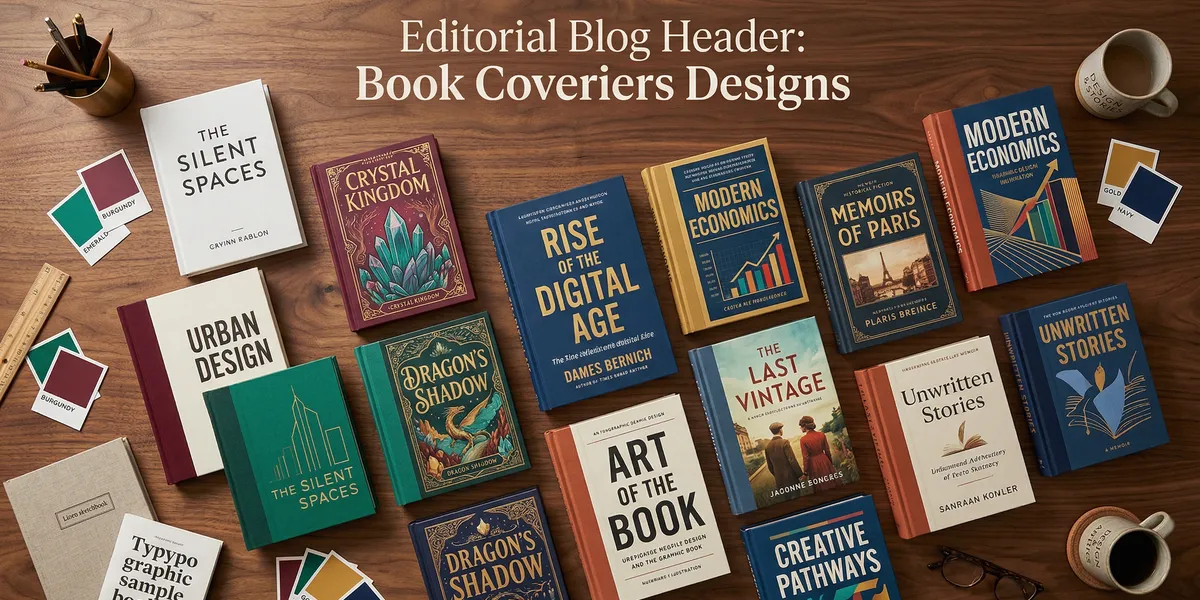
Genre-Specific Book Cover Design Ideas
The fastest way to create a cover that sells is to match your genre’s visual expectations. Readers have been trained by thousands of covers to associate certain design elements with certain types of books.
Break these conventions, and readers won’t find you. Nail them, and your cover becomes a magnet.
Romance Book Cover Design Ideas
Romance readers expect warmth, emotion, and connection. The most effective romance covers in 2026 use:
- Illustrated couples in vector-based or hand-drawn art styles (the “romantasy” trend has made illustration dominant over photography)
- Warm color palettes — blush pink, deep burgundy, gold accents, and sunset tones
- Script or serif fonts for titles, paired with a clean sans-serif for author names
- Soft, dreamy backgrounds — florals, starry skies, or abstract watercolor washes
Dark romance subgenre covers lean into moody blacks, deep reds, and shadowy imagery.
Thriller and Mystery Cover Design Ideas
Thriller covers need to create tension at a glance. Effective approaches include:
- Dark, high-contrast color schemes — black backgrounds with a single bold accent color (red, electric blue, or stark white)
- Bold sans-serif typography with tight kerning — the title should feel urgent
- Silhouettes and shadowy figures that suggest danger without revealing too much
- Cracked textures, grunge effects, or distressed typography for psychological thrillers
Keep the composition clean. One strong visual element beats a cluttered collage.
Fantasy and Sci-Fi Cover Design Ideas
Fantasy and science fiction readers expect world-building to start on the cover:
- Detailed illustrations of landscapes, characters, or magical elements
- Rich, saturated color palettes — deep purples, midnight blues, emerald greens for fantasy; neon accents, metallic silvers, and stark whites for sci-fi
- Ornate serif fonts for epic fantasy; futuristic sans-serif or display fonts for sci-fi
- Embossed or foil-effect elements in digital covers to mimic premium print editions
The “grand, fantastical” cover style continues to dominate bestseller lists because it promises scope and adventure.
Nonfiction and Self-Help Cover Design Ideas
Nonfiction covers sell the transformation, not the topic:
- Bold, oversized typography — the title IS the cover on most successful nonfiction books
- 2-3 color maximum with high contrast (think Atomic Habits or The Subtle Art)
- Clean, minimal layouts with generous white space
- Simple iconography or abstract shapes instead of photographs
Business books specifically benefit from confident color choices — navy, black, or deep green paired with white or gold text.
Memoir and Literary Fiction Cover Design Ideas
These genres reward covers that feel artistic and intentional:
- Fine art photography or painterly illustration styles
- Muted, sophisticated color palettes — olive, cream, dusty blue, terracotta
- Elegant serif typography with generous letter spacing
- Symbolic imagery that hints at themes without being literal
Minimalist covers with a single striking image and restrained typography perform especially well in literary fiction.
Children’s Book Cover Design Ideas
Children’s covers need to capture attention and imagination simultaneously:
- Bright, saturated primary colors that pop on screen and shelf
- Character-driven illustrations featuring the protagonist in an action or emotional moment
- Playful, rounded typography that feels fun and approachable
- Whimsical details — hidden elements, textures, or interactive visual elements
The illustration style should match your target age group. Board books use simpler shapes; middle grade can handle more detailed artwork.
Color Psychology for Book Covers
Every color triggers a specific emotional response. Choosing the right palette isn’t just aesthetic — it’s strategic.
| Color | Emotion | Best For |
|---|---|---|
| Red | Passion, urgency, danger | Romance, thrillers, action |
| Blue | Trust, calm, depth | Business, sci-fi, literary fiction |
| Green | Growth, nature, wealth | Self-help, finance, eco-fiction |
| Yellow | Optimism, energy, warmth | Humor, self-help, children’s |
| Purple | Mystery, luxury, creativity | Fantasy, spirituality, premium nonfiction |
| Black | Power, sophistication, darkness | Thriller, horror, luxury nonfiction |
| White | Clarity, simplicity, purity | Minimalist nonfiction, literary fiction |
| Gold | Premium, success, achievement | Business, memoir, award-winning fiction |
The two-color rule: Stick to two or three colors maximum. High-contrast combinations (teal and orange, navy and gold, black and red) catch the eye in thumbnail view. Monochromatic schemes feel sophisticated but need strong typography to compensate.
Typography That Makes Covers Pop
Typography accounts for roughly 60% of your cover’s impact — especially in nonfiction, where the title often IS the entire design.
Font Pairing Fundamentals
Limit yourself to two fonts maximum — one for the title, one for the author name. A third font for a subtitle is acceptable but rarely necessary.
Effective pairings follow a simple rule: contrast without conflict. Pair a bold display font with a clean body font. A decorative serif with a simple sans-serif. Never pair two fonts that look similar but aren’t identical — it reads as a mistake.
Readability at Thumbnail Size
This is the single biggest typography mistake self-published authors make. Your title must be legible when your cover is the size of a postage stamp.
Test your cover design by shrinking it to 100x150 pixels. If you can’t read the title, increase the font size, reduce the word count, or simplify the font choice.
Pro tip: Sans-serif fonts are generally more readable at small sizes. If you’re using a serif or decorative font, make it significantly larger.
Typography Trends in 2026
The biggest shift is typography as visual element. Letters interweave with background imagery, wrap around objects, or become the primary graphic element themselves.
Other trends gaining traction:
- Hand-lettered titles that feel personal and artisanal
- Mixed-weight typography where one word in the title is dramatically bolder or larger
- Layered text effects with subtle shadows, outlines, or texture fills
- Vertical or diagonal text placement for a modern, eye-catching composition
Minimalist vs. Maximalist Cover Designs
Two opposing philosophies dominate book cover design in 2026, and both can work brilliantly.
The Minimalist Approach
Minimalist covers strip the design down to essentials: one font, one color accent, generous white space. They work because they feel confident and unhurried.
Best for: Literary fiction, business nonfiction, memoir, poetry
The key to minimalism is restraint with purpose. Every element on the cover must earn its place. A single well-chosen image, a carefully set title, and nothing else.
The Maximalist Approach
Maximalist covers embrace complexity: layered illustrations, rich color palettes, ornate borders, and detailed imagery. They work because they promise richness and depth.
Best for: Fantasy, romance, children’s books, cookbooks, art books
The key to maximalism is organized complexity. Every element should feel intentional, not chaotic. Use visual hierarchy to guide the eye from the title through the imagery to the author name.
AI-Powered Book Cover Design Tools
You don’t need to hire a designer or master Photoshop to create a professional cover. AI tools have transformed cover design for self-published authors.
Our Pick — Chapter
Chapter helps you write your entire book with AI and handles cover design as part of the complete publishing workflow. Instead of juggling separate tools for writing, formatting, and cover creation, you get everything in one place.
Best for: Authors who want a complete book creation workflow — writing, editing, and design Pricing: $97 one-time (nonfiction) | Varies (fiction) Why we built it: Most authors waste hours switching between writing tools, formatters, and design apps. Chapter brings it all together.
Other Cover Design Tools Worth Considering
Canva — The most popular DIY design tool with thousands of book cover templates. Free tier is generous, and the drag-and-drop interface requires zero design experience. Best for authors who want full creative control with training wheels.
Reedsy — Offers a free book cover editor with genre-specific templates. The designs tend toward professional and understated. Best for literary fiction and serious nonfiction.
99designs — A marketplace connecting you with professional designers through design contests or direct hire. Expect to pay $300-1,500+ for a custom cover. Best for authors who want a completely original, hand-crafted design.
Adobe Express — Adobe’s simplified design tool with AI-powered features. More capable than Canva for authors with some design experience, but the learning curve is steeper.
Miblart — A dedicated book cover design service with pre-made and custom options. They specialize in genre fiction covers and understand reader expectations well.
| Tool | Best For | Price | DIY or Pro |
|---|---|---|---|
| Chapter | Complete book workflow | $97 one-time | DIY + AI |
| Canva | Quick DIY covers | Free - $13/mo | DIY |
| Reedsy | Literary/nonfiction | Free editor | DIY |
| 99designs | Custom pro design | $300-1,500+ | Pro |
| Adobe Express | Design-savvy authors | Free - $10/mo | DIY |
| Miblart | Genre fiction | $150-500+ | Pro |
How to Design a Book Cover Step by Step
Whether you’re designing yourself or briefing a designer, follow this process:
Step 1: Research Your Genre
Browse the top 20 bestsellers in your specific Amazon subcategory. Screenshot their covers. Look for patterns in color, typography, imagery, and layout.
You’re not copying — you’re learning the visual language your readers already speak.
Step 2: Define Your Visual Concept
Answer three questions:
- What emotion should the cover trigger? (Fear? Curiosity? Warmth? Ambition?)
- What single image or element represents your book? (Don’t try to illustrate the plot — capture the feeling)
- What style matches your genre? (Illustrated? Photographic? Typographic? Minimal?)
Step 3: Choose Your Color Palette
Pick two to three colors based on genre conventions and the emotional response you want. Use the color psychology table above as your starting point.
Test your palette against competitor covers. You want to fit the genre while standing out on the shelf.
Step 4: Select Typography
Choose your title font first — it carries the most weight. Then pair it with a complementary author name font. Test readability at thumbnail size before committing.
Step 5: Compose and Refine
Arrange your elements with clear visual hierarchy: title first, imagery second, author name third. Leave breathing room around each element.
Get feedback from readers in your genre, not friends and family who’ll say anything looks nice.
The Back Cover and Spine (Don’t Forget These)
If you’re publishing a print book, the front cover is only one-third of the job.
Back Cover Essentials
Your back cover needs:
- A compelling blurb (150-200 words) that sells the book
- Author photo and bio (optional but recommended for nonfiction)
- Category and price information
- Barcode and ISBN placement
- Endorsement quotes if you have them
Keep the design consistent with your front cover — same color palette, same typography family.
Spine Design Tips
The spine is the first thing readers see on a bookshelf. Make sure:
- Your title and author name are legible even on thin spines
- The font is large enough to read at arm’s length
- The color scheme contrasts with common shelf neighbors
- You include your publisher logo if applicable
Common Book Cover Design Mistakes to Avoid
These mistakes kill sales before readers ever see your blurb:
- Too many fonts — three is the absolute maximum, and two is usually better
- Illegible thumbnails — if you can’t read the title at 100px wide, start over
- Wrong genre signals — a pastel watercolor cover on a military thriller confuses readers
- Amateur stock photos — overused, generic images scream “self-published” (and not in a good way)
- Cluttered composition — resist the urge to put every plot element on the cover
- Ignoring the back cover — a professionally designed front paired with a sloppy back cover undermines the whole package
- Designing for yourself instead of your reader — your cover isn’t for you; it’s for the person scrolling Amazon at midnight
How Much Does a Book Cover Design Cost?
Cover design costs vary dramatically based on approach:
| Approach | Cost Range | Turnaround |
|---|---|---|
| DIY with templates (Canva, Reedsy) | Free - $30 | Hours |
| AI-assisted (Chapter, Adobe Express) | $10 - $97 | Hours |
| Pre-made covers (Miblart, The Book Cover Designer) | $50 - $200 | Days |
| Custom freelance designer (99designs, Fiverr) | $200 - $800 | 1-3 weeks |
| Professional design firm | $800 - $3,000+ | 2-6 weeks |
For most self-published authors, the sweet spot is either a quality pre-made cover customized to your book or an AI-assisted design refined with professional feedback.
Don’t cheap out on your cover. It’s the single highest-ROI investment in your entire book launch. A $300 cover that sells 500 extra copies pays for itself many times over.
Do You Need a Professional Designer?
Not always — but sometimes yes. Here’s a quick decision framework:
Design it yourself if:
- Your genre has simple, typography-driven covers (business, self-help)
- You have a decent eye for design and can use tools like Canva
- Your budget is under $100
- You’re publishing your first book and testing the market
Hire a professional if:
- Your genre demands complex illustration (fantasy, children’s, romance)
- Your book is the centerpiece of a business or speaking career
- You’ve validated your book concept and want maximum sales impact
- You’re publishing through a traditional or hybrid publisher
Can AI Design a Good Book Cover?
AI cover design tools have improved dramatically. They can generate concepts, suggest layouts, and create imagery that would have required a professional designer just two years ago.
AI excels at:
- Generating initial concepts and mood boards quickly
- Creating background imagery, patterns, and textures
- Suggesting color palettes based on genre conventions
- Producing multiple variations for A/B testing
AI still struggles with:
- Complex character illustrations with consistent proportions
- Text placement and typography refinement
- Understanding subtle genre conventions
- Creating truly original, standout designs
The best approach combines AI speed with human judgment. Use AI to generate options fast, then refine the winner with careful typography and layout adjustments.
Book Cover Design Ideas by Trend in 2026
Stay current with these trending design approaches:
- Integrated typography — letters woven into illustrations, interacting with background elements rather than sitting on top
- Hand-painted and textured covers — a reaction against the polished digital look, especially in literary fiction
- Bold monochromatic schemes — single-color covers with dramatic typography
- Retro and vintage revival — 70s color palettes, art deco borders, and nostalgic illustration styles
- 3D and dimensional elements — embossed effects, layered compositions, and depth illusion in digital covers
FAQ
What Makes a Good Book Cover Design?
A good book cover design instantly communicates your genre, creates an emotional response, and remains legible at thumbnail size. The best covers use a focused color palette (2-3 colors), clear typography hierarchy, and a single strong visual concept. Professional-quality covers build reader trust and dramatically increase click-through rates on retail platforms.
How Do I Come Up With Book Cover Ideas?
To come up with book cover ideas, start by researching the top 20 bestsellers in your Amazon subcategory. Screenshot their covers and identify patterns in color, typography, and imagery. Then define the single emotion your cover should trigger and brainstorm visual concepts that capture that feeling. Tools like Chapter and Canva can help you prototype ideas quickly.
Should I Design My Own Book Cover or Hire a Designer?
You should design your own cover if your genre uses simple, typography-driven layouts (business, self-help) and you’re comfortable with design tools. Hire a professional designer if your genre demands complex illustration (fantasy, romance, children’s) or if your book is central to your career. Most self-published authors fall somewhere in between — using AI tools and templates to create professional results on a budget.
What Size Should a Book Cover Be?
Standard ebook cover dimensions are 1,600 x 2,560 pixels (1:1.6 ratio) for Amazon KDP. Print covers vary by trim size, but the most common is 6 x 9 inches for the front panel, plus spine width (calculated from page count) and back panel. Always check your publishing platform’s specific requirements — Amazon KDP, IngramSpark, and other distributors have slightly different specifications.
How Important Is the Back Cover Design?
The back cover design is critical for print books and often overlooked by self-published authors. It needs a compelling 150-200 word blurb, author bio, ISBN barcode, and category information. A professionally designed front cover paired with a sloppy back cover undermines reader trust. Keep the back cover’s color palette, typography, and design style consistent with the front.