Book formatting is the process of turning your finished manuscript into a professional, publish-ready layout with correct margins, fonts, spacing, and page structure. Get it right and your book looks like it belongs on a bookstore shelf. Get it wrong and readers notice before they finish page one.
In this guide, you’ll learn:
- How to choose the right trim size, margins, and fonts for your genre
- The step-by-step process for formatting both print books and ebooks
- How to structure front matter, back matter, and chapter openings like a pro
- Which formatting tools save you the most time in 2026
Here’s everything you need to format your book like a professional publisher.
Why Book Formatting Matters
Your readers may never think about formatting consciously. But they feel it. A poorly formatted book creates friction on every page: cramped margins that make text hard to follow, inconsistent spacing that breaks reading flow, and amateur chapter headings that scream self-published.
Professional formatting does three things:
- Improves readability. Proper line spacing, margins, and font choices reduce eye strain and keep readers engaged longer.
- Builds credibility. A clean layout signals quality. Readers, reviewers, and retailers all judge books by their interior design.
- Meets platform requirements. Amazon KDP, IngramSpark, and Apple Books each have specific formatting specs. Miss them and your book gets rejected or displays incorrectly.
According to IngramSpark’s formatting guide, formatting errors are one of the top reasons self-published books get returned during the review process.
How to Choose the Right Trim Size
Your trim size is the physical dimensions of your printed book. It affects everything downstream: margins, font size, page count, and printing cost.
Here are the most common trim sizes by genre:
| Genre | Common Trim Size | Notes |
|---|---|---|
| Fiction (novel) | 5.5” x 8.5” | Industry standard for most fiction |
| Fiction (mass market) | 4.25” x 6.87” | Smaller, pocket-sized paperbacks |
| Nonfiction | 6” x 9” | Standard for business, self-help, memoir |
| Children’s books | 8.5” x 8.5” | Square format, common for picture books |
| Poetry | 5” x 8” | Smaller format suits shorter line lengths |
| Textbooks/workbooks | 8.5” x 11” | Full letter size for worksheets and diagrams |
Pick your trim size before formatting. Changing it later means redoing your entire layout. If you’re unsure, 5.5” x 8.5” (fiction) or 6” x 9” (nonfiction) are safe defaults that most printers and distributors support.
For ebooks, trim size doesn’t apply. Ebook readers are reflowable, meaning the text adapts to whatever screen size your reader uses.
Setting Up Margins and Gutters
Margins create the white space around your text block. They’re not decorative. They serve a functional purpose: keeping text away from the edges where it could get cut during trimming, and providing enough room for the binding so words don’t disappear into the spine.
Standard margin settings for a 6” x 9” book:
- Top margin: 0.75” to 1”
- Bottom margin: 0.75” to 1”
- Outside margin: 0.5” to 0.75”
- Inside margin (gutter): 0.75” to 1”
The gutter is the margin closest to the spine. It needs to be wider than your outside margin because part of the page curves into the binding. The thicker your book, the larger your gutter needs to be.
A common mistake: setting all four margins to the same width. Your inside margin should always be wider than your outside margin. If they’re equal, text near the spine becomes hard to read without cracking the book open flat.
For ebooks, margins are handled by the reading device. You don’t set them manually. Focus on clean paragraph formatting instead.
Choosing the Right Fonts for Your Book
Font choice affects readability more than any other single formatting decision. The wrong font makes even great writing feel hard to read.
For print books, use serif fonts. Serifs are the small decorative strokes at the ends of letters. They guide the eye along the line and improve readability in long-form printed text.
Recommended serif fonts for book interiors:
- Garamond — The publishing industry standard. Clean, elegant, and highly readable at smaller sizes.
- Palatino — Slightly wider than Garamond. Works well for nonfiction.
- Caslon — Classic book font with excellent readability. Used in many traditionally published novels.
- Baskerville — More modern feel. Good for literary fiction and academic nonfiction.
- Georgia — Designed for screen readability but works well in print too.
For ebooks, sans-serif fonts work well because screens render them cleanly. But most ebook platforms let readers choose their own font, so your choice matters less for digital formats.
Font size guidelines:
- Body text: 10pt to 12pt for print (11pt is the sweet spot for most trim sizes)
- Chapter titles: 18pt to 24pt
- Section headings: 14pt to 16pt
- Headers/footers: 8pt to 10pt
Line spacing (leading) should be set between 1.15 and 1.3 for print. Single spacing looks cramped. Double spacing wastes pages and feels like a manuscript, not a finished book.
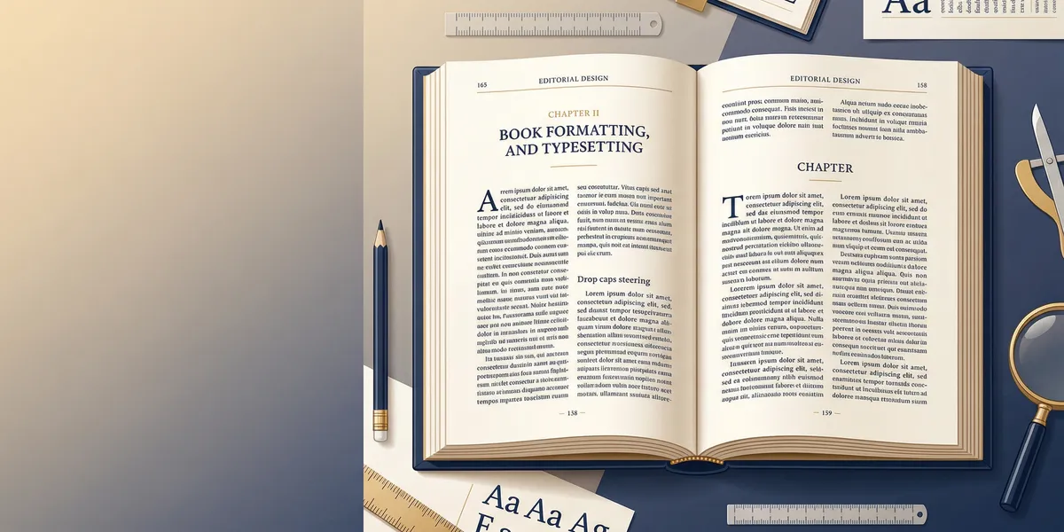
How to Format Chapter Openings
Chapter openings set the visual rhythm of your book. Every chapter should start with a consistent design that signals to the reader: new section, fresh start.
Essential elements of a chapter opening:
-
Start on a new page. Use a page break, not extra returns. Hitting Enter 20 times looks fine on your screen but breaks when the layout reflows.
-
Drop the chapter title down. Leave 2 to 3 inches of white space at the top of the page before the chapter title. This “chapter drop” is a hallmark of professional formatting.
-
Use a consistent title style. Choose one format and stick with it: “Chapter 1,” “Chapter One,” or just the chapter title without numbering. All are valid. Inconsistency is not.
-
Add a drop cap or small caps (optional). A drop cap is a large first letter that spans 2-3 lines. Small caps make the first few words of the chapter uppercase in a smaller font. Both signal a professional interior.
-
Remove the header on chapter-opening pages. Running headers (the text at the top of each page showing the book title or chapter name) should not appear on the first page of a chapter. This is a detail that separates amateur from professional layouts.
Scene breaks within chapters should use a centered ornamental break (three asterisks, a small graphic, or a blank line). Never rely on just an extra blank line. Some e-readers and PDF renderers collapse blank lines, which merges your scenes together.
Formatting Front Matter
Front matter is everything that comes before your first chapter. The order matters. Here’s the standard sequence for professionally published books:
- Half title page — Just the book title, no author name. Optional but adds a polished feel.
- Title page — Full title, subtitle, author name.
- Copyright page — Copyright notice, ISBN, publisher info, edition statement, disclaimer.
- Dedication (optional) — Keep it short. One page max.
- Table of contents — Required for nonfiction. Optional for fiction, but helpful for ebooks.
- Foreword (optional) — Written by someone other than the author.
- Preface (optional) — Written by the author about why they wrote the book.
- Introduction (optional) — Content that sets up the book but isn’t part of the main narrative.
Formatting rules for front matter:
- Front matter pages use lowercase Roman numerals (i, ii, iii, iv) or no page numbers at all.
- The main body starts on page 1 (Arabic numerals) at Chapter 1.
- Each front matter element starts on a new page.
- Front matter pages typically don’t have running headers.
Formatting Back Matter
Back matter provides supplementary information after your final chapter. Not every element applies to every book.
Common back matter elements:
- Acknowledgments — Thank people who helped. Keep it genuine and readable.
- About the author — Short bio with a photo (optional). Include your website and social links.
- Also by this author — List your other books. This is free marketing on every copy you sell.
- Appendices — Supplementary material, charts, or reference data.
- Glossary — Definitions of specialized terms (useful for fantasy, sci-fi, and technical nonfiction).
- Bibliography/References — Required for academic and research-based nonfiction.
- Index — Common in textbooks and technical references. Rarely needed for general nonfiction or fiction.
Pro tip: Your “Also by this author” page is one of the highest-converting elements in your entire book. Readers who finish your book are primed to buy the next one. Make this page easy to scan and include direct links in the ebook version.
Print Book Formatting vs. Ebook Formatting
Print and ebook formatting follow different rules. You can’t use the same file for both and expect good results.
| Element | Ebook | |
|---|---|---|
| Layout | Fixed pages, exact positioning | Reflowable text, adapts to screen |
| Fonts | You control the exact font | Reader often overrides your choice |
| Images | Fixed size and position | Must be responsive and compressed |
| Page numbers | Required, printed on every page | Generated by the reading device |
| Margins | You set them precisely | Controlled by the reading app |
| File format | PDF (print-ready) | ePub or KPF (Kindle) |
| Headers/footers | Custom running headers | Not used (device handles navigation) |
| Paragraph indents | First-line indent, no paragraph spacing | Same, but defined in CSS/HTML |
For print: Your final output is a print-ready PDF with embedded fonts, correct bleeds (if you have images that extend to the page edge), and crop marks. Most print-on-demand services like Amazon KDP and IngramSpark provide templates with pre-set margins and bleeds.
For ebooks: Your output is an ePub file (or KPF for Kindle). Ebooks are essentially HTML and CSS packaged in a container. The formatting needs to be clean and minimal. Overformatting causes display issues across devices.
How to Format a Book Step by Step
Here’s the complete workflow for formatting your manuscript into a publish-ready book:
Step 1: Start with a clean manuscript
Strip out all manual formatting first. Remove extra spaces, manual tab indents, double spaces after periods, and any hard page breaks that aren’t at chapter endings. In Word, use Find & Replace to clean up double spaces and manual line breaks.
Step 2: Set your page size and margins
Configure your document to match your trim size. Set up mirror margins (different inside and outside margins) for print books. Leave room for the gutter based on your estimated page count.
Step 3: Choose your fonts and set paragraph styles
Pick your body font, heading font, and set up paragraph styles. Use styles (not manual formatting) for everything: body text, chapter titles, section headings, block quotes, and captions. Styles ensure consistency and make global changes instant.
Step 4: Format your chapter openings
Apply your chapter-opening template: page break, chapter drop, title style, and optional drop cap or small caps. Do one chapter first, get it right, then apply the same formatting to every chapter.
Step 5: Add front matter and back matter
Insert your copyright page, dedication, table of contents, and other front matter before Chapter 1. Add acknowledgments, about the author, and your “also by” page after the final chapter.
Step 6: Set up running headers and page numbers
Add page numbers to the footer or header. Set up running headers with the book title on left pages and the chapter title on right pages (or your preferred style). Suppress headers on chapter-opening pages and front matter.
Step 7: Handle widows and orphans
A widow is a single line of a paragraph stranded at the top of a page. An orphan is a single line at the bottom. Both look unprofessional. Most word processors have widow/orphan control settings. Turn them on, then manually review for any that slip through.
Step 8: Export your final files
For print: export as PDF with fonts embedded and images at 300 DPI minimum. For ebooks: export as ePub. Run your ePub through a validator like EPUB Check to catch structural errors before uploading.
Best Book Formatting Tools in 2026
You don’t need to format by hand. These tools handle the heavy lifting.
Our Pick — Chapter
Chapter handles the entire workflow from writing to formatted, export-ready files. The AI assists with writing, outlining, and editing, and the platform produces properly formatted ePub and PDF files that meet KDP and IngramSpark specs. Over 2,147 authors have used Chapter to create 5,000+ books.
Best for: Authors who want a single tool for writing and formatting Pricing: $97 one-time (nonfiction) | Varies (fiction) Why we built it: Most authors spend hours wrestling with formatting after finishing their manuscript. Chapter eliminates that step entirely.
Other solid options:
- Atticus — Dedicated formatting tool with 17+ themes. $147 one-time. Great if you already have a finished manuscript and just need formatting.
- Vellum — Beautiful output with minimal effort. Mac only. $200-$250 one-time.
- Reedsy Studio — Free browser-based option with professional presets. Good for budget-conscious authors.
- Kindle Create — Amazon’s free formatting tool. Only outputs Kindle-compatible files.
For a deeper comparison, see our best book formatting software breakdown.
Common Book Formatting Mistakes to Avoid
These errors show up constantly in self-published books. Every one of them is preventable.
- Using multiple spaces or tabs to create indents. Use paragraph styles with first-line indent settings. Manual spacing breaks when the layout reflows.
- Skipping the gutter margin. Text that disappears into the binding is the #1 formatting complaint from print book readers.
- Using decorative fonts for body text. Save fancy fonts for chapter titles at most. Body text needs a clean, readable serif font.
- Forgetting to embed fonts in your PDF. If your font isn’t embedded, the printer substitutes a default. Your carefully chosen Garamond becomes Times New Roman.
- Not testing your ebook on multiple devices. An ebook that looks perfect on Kindle Paperwhite might break on the Kindle app for iPhone. Test on at least 2-3 different readers.
How Long Does It Take to Format a Book?
Formatting a book takes 2 to 10 hours depending on your book’s length, complexity, and the tool you use. A straightforward 60,000-word novel with no images formats faster than a 200-page nonfiction book with tables, charts, and callout boxes.
Using a dedicated formatting tool like Chapter or Atticus cuts the time significantly. Manual formatting in Word or InDesign takes longer but gives you more control over every detail.
Time estimates by method:
| Method | Time Estimate | Best For |
|---|---|---|
| AI-assisted tool (Chapter) | 30 min to 2 hours | Authors who want speed + quality |
| Dedicated formatter (Atticus, Vellum) | 2 to 4 hours | Authors who want design control |
| Word/Google Docs | 4 to 8 hours | Budget-conscious authors |
| InDesign | 8 to 20 hours | Designers and complex layouts |
| Professional service | 1 to 2 weeks (turnaround) | Authors who want hands-off |
Can You Format a Book in Microsoft Word?
Yes, you can format a book in Microsoft Word, but it requires careful setup. Word wasn’t designed for book layout, so you need to configure custom page sizes, mirror margins, section breaks, and styles manually.
Word works best for: Simple text-heavy books without complex layouts, like novels and straightforward nonfiction.
Word struggles with: Image-heavy layouts, precise typographic control, and ePub export. If your book has diagrams, sidebars, or needs pixel-perfect positioning, consider a dedicated tool.
If you go the Word route, use the Reedsy Book Editor as a free alternative. It handles the technical formatting automatically and exports clean ePub and PDF files.
Do I Need to Hire a Professional Formatter?
You don’t need to hire a professional formatter for every book. But it depends on your book’s complexity and your comfort with formatting tools.
Format it yourself if:
- Your book is primarily text (novel, memoir, straightforward nonfiction)
- You’re comfortable using formatting software
- Your budget is tight and your time is available
- You’re using a tool like Chapter that automates the process
Hire a professional if:
- Your book has complex layouts (cookbooks, art books, textbooks)
- You need custom design elements beyond what templates offer
- Your time is more valuable than the $200-$500 formatting typically costs
- You want a completely hands-off experience
Professional book formatting services typically charge $200 to $500 for a standard book and $500 to $1,500+ for complex layouts. Check out our book formatting services guide for vetted options.
FAQ
What is book formatting?
Book formatting is the process of preparing your manuscript for publication by setting up the page layout, fonts, margins, spacing, and structure. It transforms a raw manuscript into a professionally designed interior that meets publishing platform requirements and provides a comfortable reading experience.
What is the standard format for a book?
The standard format for most books uses a 5.5” x 8.5” or 6” x 9” trim size, 11pt serif font (like Garamond), 1.15 to 1.3 line spacing, first-line paragraph indents, and mirror margins with a wider gutter on the binding side. Front matter includes a title page and copyright page at minimum.
How much does it cost to format a book?
Book formatting costs range from free to $1,500+ depending on your approach. Free tools like Reedsy Studio and Kindle Create cost nothing. AI-assisted tools like Chapter cost $97 one-time. Dedicated software like Atticus or Vellum runs $147-$250. Professional formatting services charge $200-$500 for standard books and $500-$1,500+ for complex layouts.
What is the difference between formatting and typesetting?
Formatting is the broader process of preparing a manuscript for publication, including page setup, fonts, and structure. Typesetting is a more specific term for the detailed arrangement of text on a page, including kerning, tracking, and fine-tuning line breaks. In modern self-publishing, the terms are often used interchangeably.
Can I use the same file for print and ebook?
No, you should create separate files for print and ebook. Print books use fixed-layout PDFs with exact margins, page numbers, and embedded fonts. Ebooks use reflowable ePub format where text adapts to each reader’s screen. Using a print PDF as an ebook results in tiny, unreadable text on phones. Most formatting tools export both formats from a single project.