Typesetting is the process of arranging text on a page for publication — choosing fonts, setting margins, adjusting spacing, and creating a layout that makes your book easy and pleasant to read.
In this guide, you’ll learn:
- What typesetting actually involves (and how it differs from formatting)
- The core rules professional typesetters follow
- How to typeset your own book step by step
- Which tools make the process faster in 2026
Here’s everything you need to know.
What Is Typesetting?
Typesetting is the art and craft of arranging text on a page so it reads smoothly and looks professional. It covers everything from font selection and line spacing to margin widths and page breaks.
The term dates back to the era of movable type, when printers physically arranged metal letter blocks into lines of text. Today, typesetting is done digitally — but the principles haven’t changed much.
A well-typeset book is invisible. You read it without noticing the design. A poorly typeset book is the opposite — awkward spacing, inconsistent fonts, and jarring page breaks pull you out of the story.
Typesetting vs. Formatting: What’s the Difference?
Formatting refers to the structural markup of your manuscript — headings, bold text, italics, paragraph styles. It’s what you do in a word processor like Google Docs or Microsoft Word.
Typesetting goes further. It’s the visual refinement of your formatted text for the final printed or digital product. Typesetting controls how text flows across pages, how chapter openings look, and how every element sits relative to the margins.
Think of it this way: formatting is organizing your content. Typesetting is making it beautiful.
| Aspect | Formatting | Typesetting |
|---|---|---|
| Focus | Content structure | Visual presentation |
| Tools | Word processors | Layout software (InDesign, Vellum) |
| When | During writing | After editing is complete |
| Output | Manuscript file | Print-ready PDF or ebook file |
| Who | Author | Typesetter or author with design tools |
Why Typesetting Matters for Your Book
Bad typesetting signals an amateur book. Readers may not know why your book feels “off,” but they’ll feel it.
Here’s what professional typesetting gives you:
- Readability. Proper line spacing, font size, and margins reduce eye strain and keep readers turning pages.
- Credibility. Bookstores, reviewers, and readers judge books by their interior design. A well-typeset book looks like it belongs on the shelf next to traditionally published titles.
- Fewer returns. On platforms like Amazon KDP, poorly formatted books get returned and get bad reviews. Good typesetting prevents that.
- Print compatibility. Typesetting ensures your book meets printer specifications for margins, bleeds, and trim sizes.
According to the Alliance of Independent Authors, interior design is one of the top three factors readers cite when rating self-published book quality.
The Core Rules of Professional Typesetting
Professional typesetters follow a set of rules that have been refined over centuries. Master these and your book will look like it came from a major publishing house.
1. Choose Legible, Comfortable Fonts
For body text, use a serif font like Garamond, Palatino, Caslon, or Minion Pro. Serif fonts have small strokes at the ends of letters that guide your eye along each line.
Set your body text between 10pt and 12pt depending on the font. A common pairing is 11pt Garamond with 14pt leading (line spacing).
Avoid: Decorative fonts for body text, fonts below 10pt, or more than two font families in a single book.
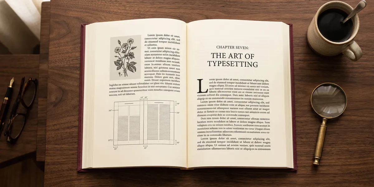
2. Set Proper Margins
Margins aren’t just white space — they serve a structural purpose. The inside margin (gutter) needs to be wider than the outside margin because the binding eats into the page.
A standard margin setup for a 6x9 trade paperback:
| Margin | Size |
|---|---|
| Top | 0.75 inches |
| Bottom | 0.875 inches |
| Outside | 0.625 inches |
| Inside (gutter) | 0.875 inches |
Your printer or self-publishing platform will have specific margin requirements. Always check those first.
3. Control Line Spacing (Leading)
Leading (pronounced “ledding”) is the vertical space between lines of text. Too tight, and the text feels cramped. Too loose, and it looks like a children’s book.
A good rule of thumb: set your leading at 120% to 145% of your font size. For 11pt type, that means 13.2pt to 15.95pt of leading.
4. Eliminate Widows and Orphans
A widow is a single line of a paragraph stranded at the top of a new page. An orphan is a single line left alone at the bottom of a page.
Both break the visual flow. Professional typesetters eliminate them by:
- Adjusting paragraph spacing slightly
- Rewriting a sentence to add or remove a line
- Using tracking adjustments (letter spacing) sparingly
Most layout software like Adobe InDesign has widow/orphan controls built in.
5. Use Consistent Chapter Openings
Every chapter should start the same way. Common approaches include:
- Drop caps — an oversized first letter spanning 2-3 lines
- Small caps for the first few words
- Chapter title in a decorative or larger font
- Extra top margin (called a “sink”) to give the chapter room to breathe
Pick one style and stick with it throughout the entire book.
6. Watch Your Hyphenation and Justification
Full justification (text aligned to both left and right margins) is standard for printed books. But it creates uneven word spacing if you’re not careful.
Fix this by enabling hyphenation in your layout software and manually checking for “rivers” — visible streams of white space running vertically through justified text.
7. Leave Enough Negative Space
Negative space (white space) isn’t wasted space. It gives your reader’s eyes a place to rest. Pages crammed with text feel exhausting.
Use generous margins, adequate line spacing, and space between sections. According to typographic style guides like Robert Bringhurst’s The Elements of Typographic Style, good typography is about the space between elements as much as the elements themselves.
How to Typeset a Book Yourself (Step by Step)
You don’t need to hire a professional to typeset your book. With the right tools and attention to detail, you can produce a professional result.
Step 1: Finalize Your Manuscript
Complete all editing — developmental, line editing, and proofreading — before you start typesetting. Any text changes after typesetting means redoing layout work.
Step 2: Choose Your Trim Size
Your trim size is the final dimensions of your printed book. Common sizes include:
- 5 x 8 inches — compact, good for fiction
- 5.5 x 8.5 inches — standard trade paperback
- 6 x 9 inches — popular for nonfiction, guides, and memoirs
- 8.5 x 11 inches — workbooks and textbooks
Your trim size determines your margins, font size, and overall page count.
Step 3: Set Up Your Page Template
Configure your document with:
- Trim size dimensions
- Mirror margins (different inside/outside margins for left/right pages)
- Master pages for headers, footers, and page numbers
- Paragraph styles for body text, headings, and special elements
Step 4: Flow Your Text
Import your manuscript into the template. Then work through it chapter by chapter:
- Apply paragraph styles consistently
- Set up chapter openings
- Place any images, tables, or illustrations
- Check for widows, orphans, and awkward page breaks
Step 5: Fine-Tune and Proof
Print a proof copy or export to PDF and review every page. Look for:
- Inconsistent spacing
- Widows and orphans
- Misaligned headers or page numbers
- Rivers in justified text
- Missing or incorrect running heads
Order a physical proof from your printer before approving the final file.
Best Typesetting Software in 2026
The right tool makes typesetting dramatically easier. Here are the top options:
Our Pick — Chapter
Chapter handles book formatting and export automatically, turning your manuscript into a professionally formatted book ready for publishing. It removes the manual typesetting headaches so you can focus on writing.
Best for: Authors who want professional results without learning layout software Pricing: $97 one-time (nonfiction) Why we built it: Most authors aren’t designers — Chapter bridges that gap with AI-powered formatting that follows typesetting best practices.
Adobe InDesign
The industry standard for professional typesetting. InDesign gives you complete control over every element on every page.
Best for: Professional typesetters and design-savvy authors Pricing: $22.99/month (Creative Cloud) Strengths: Unlimited control, professional output, industry standard Limitations: Steep learning curve, subscription pricing
Vellum
A Mac-only tool designed specifically for book formatting. Vellum produces beautiful print and ebook files with minimal effort.
Best for: Mac users who want drag-and-drop simplicity Pricing: $249.99 one-time (print + ebook) Strengths: Gorgeous templates, easy to use, great ebook output Limitations: Mac only, limited customization compared to InDesign
Atticus
A web-based book formatting tool that works on any device. Atticus balances ease of use with enough customization for most authors.
Best for: Authors on any platform who want flexibility Pricing: $147 one-time Strengths: Cross-platform, good templates, active development Limitations: Fewer design options than InDesign
Reedsy Book Editor
A free, browser-based tool for basic typesetting. Good for authors on a tight budget who need clean, simple formatting.
Best for: Budget-conscious authors with straightforward books Pricing: Free Strengths: No cost, clean output, easy to learn Limitations: Limited customization, basic templates
| Tool | Best For | Price | Platform |
|---|---|---|---|
| Chapter | AI-powered formatting | $97 one-time | Web |
| InDesign | Full professional control | $22.99/mo | Mac/Windows |
| Vellum | Beautiful Mac-native design | $249.99 one-time | Mac only |
| Atticus | Cross-platform flexibility | $147 one-time | Web |
| Reedsy | Free basic formatting | Free | Web |
DIY Typesetting vs. Hiring a Professional
Not sure whether to typeset your book yourself or hire someone? Here’s how to decide.
Typeset it yourself if:
- Your book is straightforward (mostly text, few images)
- You’re comfortable with software and templates
- You want to save money and learn a new skill
Hire a professional if:
- Your book has complex layouts (cookbooks, art books, textbooks)
- You want the highest possible quality
- Your time is better spent writing than formatting
How Much Does Professional Typesetting Cost?
Professional typesetting typically costs $500 to $2,500 depending on:
- Book length (page count)
- Complexity (text-only vs. image-heavy)
- Typesetter’s experience and reputation
- Turnaround time
For a standard 200-page novel, expect to pay around $500-$800. A complex nonfiction book with tables, images, and sidebars might run $1,500-$2,500.
You can find professional typesetters on platforms like Reedsy, 99designs, and the Editorial Freelancers Association.
Common Typesetting Mistakes to Avoid
- Using too many fonts. Stick to two font families max — one for headings, one for body text.
- Ignoring the gutter. If your inside margin is too narrow, text disappears into the binding.
- Skipping the proof. Always order a physical proof before approving your final file. Digital previews miss issues that jump out on paper.
- Inconsistent spacing. If your chapter sinks, paragraph spacing, or leading varies throughout the book, it looks unprofessional.
- Forgetting ebook differences. Ebook typesetting is reflowable — you can’t control exact page breaks. Focus on clean paragraph styles and proper hierarchy instead.
How Long Does It Take to Typeset a Book?
Typesetting a standard book takes 5 to 20 hours depending on complexity. A simple 200-page novel with no images might take 5-8 hours using a template-based tool like Vellum or Chapter. A complex nonfiction book with tables, images, and pull quotes could take 15-20 hours in InDesign.
Using AI-powered tools like Chapter can cut this time significantly by automating font selection, spacing, and layout decisions.
Can You Typeset a Book in Microsoft Word?
You can typeset a book in Microsoft Word, but it’s not ideal. Word is a word processor, not a page layout tool. It lacks precise control over:
- Baseline grids
- Optical margin alignment
- Advanced hyphenation rules
- Master page templates
- Bleed and crop marks
If Word is your only option, use a professional Word template designed for book interiors. But for the best results, export your final manuscript to a dedicated typesetting tool.
What’s the Difference Between Typesetting and Typography?
Typesetting is the practical process of arranging text on a page for a specific publication. Typography is the broader art and study of designing typefaces and using type effectively.
Every typesetter uses typography principles, but not every typographer does typesetting. Typography is the theory. Typesetting is the application.
FAQ
What Does a Typesetter Do?
A typesetter arranges text, images, and other elements on a page to create a professional, readable layout for print or digital publication. They choose fonts, set margins, control spacing, eliminate widows and orphans, and ensure the final file meets printer specifications. Modern typesetters use software like Adobe InDesign, Vellum, or Chapter to produce publication-ready files.
How Much Does It Cost to Typeset a Book?
Typesetting a book costs between $500 and $2,500 for professional services, depending on page count, complexity, and turnaround time. DIY typesetting with tools like Chapter ($97 one-time) or Reedsy (free) can reduce costs to nearly zero, though complex layouts still benefit from a professional’s eye.
What Is the Best Font for Book Typesetting?
The best fonts for book typesetting are serif fonts like Garamond, Palatino, Caslon, and Minion Pro. These fonts feature small strokes at letter ends that guide the reader’s eye along each line, reducing fatigue. Set body text between 10pt and 12pt with leading at 120-145% of the font size for optimal readability.
Can I Typeset My Own Book?
Yes, you can typeset your own book using modern tools like Chapter, Vellum, Atticus, or Adobe InDesign. Template-based tools make it possible to achieve professional results without design training. For straightforward books (mostly text, few images), DIY typesetting produces excellent results. Complex layouts with heavy image integration may still benefit from a professional typesetter.
What’s the Difference Between Typesetting and Book Formatting?
Typesetting is the visual refinement of text for final publication — controlling fonts, spacing, margins, and page flow. Book formatting is the structural markup of your manuscript — applying headings, bold, italics, and paragraph styles. Formatting happens during writing; typesetting happens after editing is complete, transforming your formatted manuscript into a print-ready or ebook-ready file.