The interior design of your book is what readers experience for hours — and bad formatting makes even great writing feel amateur. Professional interior design isn’t about fancy decorations. It’s about typography, margins, spacing, and layout choices that make your book comfortable and effortless to read.
In this guide, you’ll learn:
- The typography rules that separate professional books from amateur ones
- How to set margins, headers, and page numbers correctly
- Chapter opener design that looks polished without a graphic designer
- Formatting differences between print and ebook interiors
Here are the interior design fundamentals every self-published author needs.
Typography: The Foundation of Book Design
Choose the Right Body Font
Your body font is the most important design decision. Readers will look at it for hours — it needs to be invisible. If they notice the font, it’s the wrong font.
Best body fonts for print books:
- Garamond — The classic choice. Elegant, readable, space-efficient.
- Caslon — Warm and traditional. Works beautifully for literary fiction and narrative nonfiction.
- Minion Pro — Modern classic with excellent readability. Adobe’s workhorse.
- Palatino — Slightly larger x-height for improved readability. Good for older readers.
- Georgia — If you’re limited to free fonts, Georgia is the best option for body text.
Avoid for body text: Times New Roman (too associated with documents), Calibri (screen font, not print), any sans-serif (harder to read in long-form print), any decorative or display font.
Font Size and Leading
| Book Trim Size | Recommended Font Size | Leading (Line Spacing) |
|---|---|---|
| 5” × 8” | 10-11pt | 13-14pt |
| 5.5” × 8.5” | 11-12pt | 14-15pt |
| 6” × 9” | 11-12pt | 14-15pt |
| 8.5” × 11” (textbook) | 10-11pt | 13-14pt |
Leading (the space between lines) should be 120-145% of your font size. Tight leading makes text feel cramped. Loose leading wastes space and breaks the reader’s eye flow.
Paragraph Formatting
Choose one style and be consistent:
- Indented paragraphs (standard for fiction and most nonfiction) — First line indented 0.25-0.5”, no space between paragraphs. This is the traditional book look.
- Block paragraphs (common in business and technical books) — No indent, one line of space between paragraphs. More modern but uses more pages.
Never indent the first paragraph after a heading, scene break, or chapter opener. This is a typographic convention that signals a fresh start.
Margins and Page Layout
Standard Margins for Print Books
| Edge | Measurement | Notes |
|---|---|---|
| Inside (gutter) | 0.75-0.875” | Wider to account for binding |
| Outside | 0.5-0.75” | Where the reader holds the book |
| Top | 0.5-0.75” | Above the header/running head |
| Bottom | 0.625-0.875” | Below the last line of text |
The inside margin (gutter) must be larger than the outside margin because pages curve into the binding. For books over 300 pages, increase the gutter to 0.875-1” to compensate for the deeper curve.
Text Block Placement
Your text block (the area where body text lives) should be slightly higher than center on the page — not mathematically centered. This subtle offset looks balanced to the human eye and is standard in professional book design.
Headers and Page Numbers
Running Heads
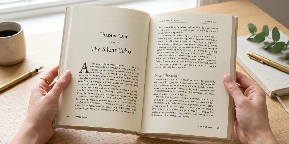
Running heads (text at the top of each page) help readers navigate. Standard conventions:
- Left page: Book title or section title
- Right page: Chapter title or author name
- Font: Same family as body text, 2pt smaller, often small caps or italic
Skip running heads on:
- Chapter opening pages
- Blank pages
- Front matter pages (title page, copyright, dedication)
Page Numbers
- Place at the bottom center or outside bottom corners
- Same font as running heads
- Use lowercase Roman numerals (i, ii, iii) for front matter
- Start Arabic numerals (1, 2, 3) at chapter one or the introduction
- No page number on blank pages or chapter opener pages
Chapter Openers
The chapter opening page is where most amateur books reveal themselves. Here’s how to make yours look professional:
Start on the Right
Chapters traditionally begin on a right-hand (recto) page. This means you may need blank left-hand (verso) pages before some chapters. These blank pages are normal — don’t fill them with quotes or unnecessary content.
Drop the Text Start
Begin body text 1/3 to 1/2 of the way down the page. This whitespace is called a “sink” and gives each chapter a clean, intentional opening. It’s the single most impactful design choice for a professional look.
Chapter Title Styling
- Use a larger font or different weight (not a different font family)
- Center or left-align — pick one and be consistent
- If using chapter numbers, keep them simple: “Chapter One” or “1” — not ornate designs
- Add generous space between the chapter title and the first line of text
Ornamental Elements (Optional)
A simple ornament, rule line, or small decorative element between the chapter number and title can add elegance. Keep it minimal. One small element is classic; multiple decorative pieces look cluttered.
Scene Breaks and Section Breaks
Scene Breaks
Use one of these to signal a scene change within a chapter:
- Three asterisks centered (* * *)
- A single ornamental glyph centered (❧, ✦, or similar)
- Extra line space (one blank line — but this can be invisible at page breaks)
The extra-line-space method alone is risky because it disappears when a scene break falls at the top or bottom of a page. Always use a visual marker.
Section Breaks
For nonfiction books with major section shifts:
- A numbered or titled subsection with a clear heading
- Extra space (1-2 blank lines) before the heading
- Consistent heading hierarchy throughout
Front Matter and Back Matter
Front Matter Order
- Half-title page (book title only, no subtitle or author)
- Also-by page (optional)
- Title page (full title, subtitle, author name)
- Copyright page
- Dedication (optional)
- Table of contents
- Foreword (optional, written by someone else)
- Preface or introduction (optional)
Back Matter Order
- Acknowledgments
- About the author
- Also-by page (if not in front)
- Notes/endnotes
- Bibliography/references
- Index (for nonfiction)
Print vs. Ebook Interior Differences
| Element | Ebook | |
|---|---|---|
| Font control | You choose the exact font | Reader chooses (your font is a suggestion) |
| Page numbers | Fixed | Dynamic (no traditional page numbers) |
| Headers | Running heads standard | Not used |
| Images | Fixed placement | Reflowable, reader-adjustable |
| Margins | Fixed, precise | Reader-adjustable |
| Chapter links | Physical table of contents | Clickable hyperlinked TOC (required) |
Design your print edition first (more constraints), then adapt for ebook. The ebook version should be simpler — focus on clean structure and proper heading hierarchy rather than visual design.
For more on self-publishing, see our guides on bleed settings for covers, self-publishing platforms, and publishing costs.
Our Pick — Chapter
Chapter helps nonfiction authors write professional manuscripts ready for formatting. Over 2,147 authors have created 5,000+ books on the platform — and proper interior design makes each one look as good as it reads.
Best for: Nonfiction authors producing publication-ready manuscripts Pricing: $97 one-time
FAQ
What is book interior design?
Book interior design is the layout and typography of the pages inside a book — including font choice, margins, spacing, headers, page numbers, chapter openers, and the overall visual structure. Professional interior design makes a book comfortable to read and distinguishes self-published books from amateur productions.
What font size should a book use?
Most printed books use 10-12pt font for body text, depending on the trim size and font choice. A 6”×9” book typically uses 11-12pt with leading (line spacing) of 14-15pt. Font size should be comfortable for your target reader — larger for audiences over 50, standard for general audiences.
How wide should book margins be?
Book margins should be 0.5-0.875 inches on all sides, with the inside (gutter) margin wider (0.75-0.875”) to account for binding. Books over 300 pages need wider gutters (up to 1”) because pages curve more deeply into the spine. Outside margins are typically 0.5-0.75”.
Should chapters start on a right page?
Yes, chapters traditionally start on a right-hand (recto) page in professionally designed books. This means inserting blank left-hand pages when needed. The text should begin 1/3 to 1/2 down the page (called a “sink”) to create a clean, intentional chapter opening — this is the single most impactful design choice for a polished look.