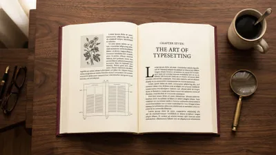
You can design a professional book interior without hiring a designer — if you start with the right template and know which settings actually matter.
In this guide, you’ll learn:
- How to set up a book interior design template from scratch (margins, fonts, spacing)
- The exact layout settings for fiction, nonfiction, and specialty books
- How to format a table of contents, drop caps, chapter headings, and running headers
- The differences between hardcover and paperback formatting
Here’s everything you need to create a book that looks like a Big Five publisher made it.
What Is a Book Interior Design Template?
A book interior design template is a pre-formatted document that sets your book’s typography, margins, spacing, and page layout so every page looks professionally typeset. You drop your manuscript text into the template, and the formatting applies automatically.
Think of it as a blueprint. The template handles trim size, font choices, line spacing, header styles, page numbers, and chapter openers. You focus on your words — the template handles how they look on the page.
Professional book designers charge $500 to $2,000+ for interior layout. A well-built template gives you 90% of that result for free. The key is choosing the right template for your genre and book type, then customizing the details that matter most.
Why Book Interior Design Matters More Than You Think
Readers notice bad formatting before they notice good writing. A self-published book with cramped margins, inconsistent fonts, or missing page numbers screams “amateur” — even if the content is excellent.
Good interior design does three things:
- Improves readability. Proper line spacing, font size, and margins reduce eye strain and keep readers turning pages.
- Builds credibility. A professionally formatted book signals that you take your work seriously. Reviewers, bookstores, and readers all judge books by their interior layout.
- Meets publishing standards. Amazon KDP, IngramSpark, and other platforms have specific formatting requirements. A good template ensures your files pass review on the first upload.
According to IngramSpark’s book design guide, interior layout is one of the top reasons self-published books get rejected during the file review process. Starting with a proper template eliminates most of those issues before they happen.
How to Choose the Right Trim Size for Your Template
Your trim size determines everything else in your template — margins, font size, line spacing, and overall page count. Pick the wrong trim size and your entire layout falls apart.
Here are the standard trim sizes by genre:
| Genre | Trim Size | Notes |
|---|---|---|
| Fiction (novel) | 5.5” × 8.5” | Most popular for paperback novels |
| Fiction (mass market) | 4.25” × 6.87” | Smaller, cheaper to print |
| Nonfiction (general) | 6” × 9” | Standard for business, self-help, memoir |
| Children’s picture book | 8.5” × 8.5” | Square format, full-color |
| Textbook / workbook | 8.5” × 11” | Letter size, room for exercises |
| Poetry / novella | 5” × 8” | Compact, elegant format |
If you’re publishing through Amazon KDP, check their trim size requirements before setting up your template. KDP supports specific dimensions, and your template needs to match exactly.
For a deeper breakdown of every available size and when to use each one, read our complete guide to book trim sizes.
How to Set Up Your Book Interior Design Template
Setting up a template takes about 30 minutes if you follow these steps in order. Skip a step and you’ll spend hours fixing layout issues later.
Step 1: Set Your Page Size and Margins
Open your document editor (Word, Google Docs, InDesign, or book formatting software) and set the page size to your chosen trim size.
Now set your margins. This is where most self-published authors go wrong. Here are the recommended margin settings:
| Margin | Fiction (5.5” × 8.5”) | Nonfiction (6” × 9”) |
|---|---|---|
| Top | 0.75” | 0.75” |
| Bottom | 0.75” | 0.75” |
| Outside | 0.625” | 0.75” |
| Inside (gutter) | 0.875” | 0.875” |
The inside margin (gutter) is always larger than the outside margin. Why? Because pages curve into the binding. If your inside margin is too small, readers will have to crack the spine to read words near the center — and your book will fall apart faster.
For books over 300 pages, increase the gutter by an additional 0.125” to account for the thicker spine.
Step 2: Choose Your Body Font
Your body font carries the entire reading experience. A bad font choice makes a 200-page book feel like 400 pages.
For fiction: Use a serif font. Garamond, Minion Pro, Palatino, or Caslon are industry standards. Set the size between 11pt and 12pt depending on the typeface.
For nonfiction: Serif fonts work well here too — Garamond, Georgia, or Cambria. For a more modern feel, try a clean serif like Source Serif Pro.
For children’s books: Use larger fonts (14pt-16pt) and rounder typefaces. Century Schoolbook and Bookman Old Style are popular choices.
Set your line spacing to 1.2 to 1.4 times the font size. A 12pt font needs about 14.4pt to 16.8pt line spacing. Too tight and the text feels claustrophobic. Too loose and pages feel empty and your page count inflates unnecessarily.
Check out our full list of the best fonts for book interiors with pairing suggestions for headings and body text.
Step 3: Design Your Chapter Openings
Chapter openings are the most visible design element in your book. They set the visual tone for the entire reading experience.
A professional chapter opening includes:
- Chapter number or title in a larger, decorative font (16pt-24pt)
- Extra white space above the chapter heading (called a “sink” — typically 1/3 down the page)
- A drop cap or decorative first letter on the opening paragraph
- No running header on the chapter’s first page
The “sink” — that blank space pushing the chapter title down from the top — is what separates professional books from amateur ones. Most traditionally published novels start their chapter text about one-third of the way down the first page. It creates breathing room and signals “something new is starting.”
Step 4: Set Up Running Headers and Page Numbers
Running headers appear at the top of each page (except chapter openers and front matter). They typically show:
- Left page (verso): Author name
- Right page (recto): Book title or chapter title
Page numbers go at the bottom center or bottom outside corner. Choose one style and stick with it throughout the book.
Important formatting rules:
- No running headers on the title page, copyright page, dedication, or chapter first pages
- Front matter (everything before Chapter 1) uses lowercase Roman numerals (i, ii, iii)
- Body text starts with Arabic numerals (1, 2, 3) beginning on the first page of Chapter 1
- Right-hand pages always have odd numbers
Step 5: Format Your Front Matter
Your front matter pages follow a specific order. Missing or misordered front matter is one of the easiest ways to spot a self-published book.
Here’s the correct sequence:
- Half title page — Book title only, no subtitle or author name
- Title page — Full title, subtitle, author name
- Copyright page — Copyright notice, ISBN, publisher info, disclaimers
- Dedication (optional)
- Table of contents (required for nonfiction, optional for fiction)
- Foreword / Preface / Introduction (if applicable)
Each of these starts on a right-hand (recto) page. If the previous section ends on a right-hand page, insert a blank left-hand page to maintain this convention.
Step 6: Format Your Back Matter
Back matter follows the same right-hand page starting rule. Common back matter sections include:
- Acknowledgments
- About the Author
- Also By [Author Name]
- Notes / Bibliography (nonfiction)
- Index (nonfiction reference books)
- Discussion Questions (book clubs)
How to Format a Table of Contents for a Book
Your table of contents (TOC) needs to be both functional and visually clean. A cluttered TOC makes your book look disorganized before the reader even starts.
For nonfiction books:
- List every chapter with its page number
- Include major subsections if the book has them (indented under the chapter)
- Use dot leaders (the dots connecting title to page number) for a polished look
- Right-align all page numbers
For fiction books:
- A simple chapter list is enough — “Chapter 1…5”
- Some novelists skip the TOC entirely for fiction, which is acceptable
- If your chapters have titles, include them
For ebooks:
- Your TOC must be hyperlinked. Every chapter title should click through to that chapter.
- Amazon KDP requires a working HTML table of contents for Kindle books.
- Most book formatting tools generate clickable TOCs automatically.
Keep your TOC on a single page whenever possible. If it runs to two pages, tighten the spacing or reduce the number of subsections listed.
How to Create Drop Caps in a Book
A drop cap is an oversized decorative letter at the beginning of a chapter’s first paragraph. It’s one of the oldest typographic traditions in book design — dating back to medieval illuminated manuscripts — and remains one of the most effective ways to signal a chapter opening.
Here’s how to create them in different tools:
In Microsoft Word:
- Select the first letter of your chapter’s opening paragraph
- Go to Insert → Drop Cap → Dropped
- Set the number of lines to drop (2-3 lines is standard)
- Choose the same font as your chapter headings or a complementary decorative font
In Adobe InDesign:
- Place your cursor in the first paragraph
- Open the Paragraph panel
- Set “Drop Cap Number of Lines” to 3
- Set “Drop Cap One or More Characters” to 1
In Atticus or Vellum: Drop caps are applied automatically through the theme settings. Select a theme that includes drop caps, or customize the opening paragraph style.
Design tips for drop caps:
- Use 2-3 lines of drop for most books. Anything larger feels overdesigned.
- Match the drop cap font to your chapter heading font for consistency.
- Don’t use drop caps on every section — only chapter openers.
- If a chapter starts with a quotation mark, include both the quote mark and the first letter in the drop cap.
If you’re using Chapter to write your book, formatting details like drop caps are handled during the export process. You focus on writing — the template applies professional design touches automatically.
Hardcover vs Paperback Formatting Differences
The formatting differences between hardcover and paperback books go beyond just the cover. Your interior template needs to account for structural differences in how these formats are bound and read.
| Feature | Paperback | Hardcover |
|---|---|---|
| Gutter margin | 0.75” - 0.875” | 0.875” - 1” |
| Outside margin | 0.5” - 0.75” | 0.75” - 1” |
| Trim size | Standard (5.5×8.5”, 6×9”) | Slightly larger (6×9”, 6.14×9.21”) |
| Paper color | Cream or white | Usually cream |
| Endpapers | None | Included (decorative or plain) |
| Dust jacket | None | Optional (adds cost) |
| Case laminate | None | Alternative to dust jacket |
Gutter adjustments are the biggest difference. Hardcover books open flatter than paperbacks because of the case binding, so you might expect to need less gutter. But hardcovers are often thicker books with more pages, which means the text block curves more at the center. Increase your gutter by 0.125” compared to paperback for the same page count.
Endpapers are the pages glued to the inside of the hardcover case. They’re usually blank or decorated with a subtle pattern. These don’t appear in your interior file — the printer adds them during the binding process.
If you’re producing both formats from the same manuscript, create two separate template files with different margin settings rather than trying to make one template work for both.
For a deeper comparison of formatting requirements across formats, check out our complete book formatting guide.
Best Book Interior Design Templates and Where to Find Them
You don’t need to build a template from scratch. Several high-quality options exist — some free, some paid. Here’s where to find them.
Our Pick — Chapter
Chapter handles interior design automatically. Write your book in Chapter’s AI-assisted editor, and the platform generates a professionally formatted interior with correct margins, typography, chapter headings, and page numbers — ready for print or ebook export.
Best for: Authors who want to skip the formatting process entirely Pricing: $97 one-time (nonfiction) Why we built it: Most authors spend more time fighting with templates than actually writing. Chapter eliminates the formatting step so you can focus on your book.
BookDesignTemplates.com
Award-winning designer Joel Friedlander created these templates specifically for self-publishers. Each template includes five types of interior pages, section breaks, running heads, and page numbers. Available for Word, Pages, InDesign, and Affinity Publisher. Templates export to both ebook and print formats.
Best for: Authors who want professional templates with maximum control Pricing: $37-$79 per template
Amazon KDP Templates
Amazon offers free Word templates for KDP publishing. They’re basic but functional — correct trim sizes, margins, and bleed settings for KDP’s requirements. Good for first-time publishers who need a no-cost starting point.
Best for: KDP-only publishers on a budget Pricing: Free
Atticus
Atticus is a web-based formatting tool with built-in templates and themes. You import your manuscript, choose a theme, and Atticus applies professional formatting automatically. Handles both ebook and print formatting with a visual preview.
Best for: Authors who want a visual drag-and-drop formatting experience Pricing: $147 one-time
Reedsy Book Editor
A free online tool that formats your book as you write. It exports print-ready PDFs and ePub files with professional typography. Limited customization compared to InDesign or dedicated templates, but the price is right.
Best for: Budget-conscious authors who want simple, clean formatting Pricing: Free
IngramSpark Templates
IngramSpark provides free cover and interior templates for all their supported trim sizes. The interior templates set up margins, bleeds, and safe zones. You’ll need to handle typography and chapter design yourself, but the structural foundation is solid.
Best for: Authors distributing through IngramSpark Pricing: Free
Common Mistakes to Avoid
These formatting errors appear in 90% of self-published books. Check your template against this list before uploading:
- Inconsistent spacing after chapter headings. Every chapter opener should have identical spacing. Use paragraph styles, not manual spacing.
- Wrong paper color selection. Fiction and memoir use cream paper. Most nonfiction uses white. Choosing wrong makes your book feel off even if readers can’t pinpoint why.
- Mirrored margins not enabled. Print books need mirrored (facing pages) margins so the gutter alternates sides. If your margins aren’t mirrored, every other page will have the wrong gutter position.
- Missing widow and orphan control. A “widow” is a single line of a paragraph stranded at the top of a new page. An “orphan” is a single line stranded at the bottom. Enable widow/orphan control in your paragraph settings — every word processor has this option.
- Forgetting the gutter. The inside margin must be larger than the outside margin. Equal margins on all sides guarantee text disappearing into the binding.
How Long Does It Take to Format a Book Interior?
Formatting a book interior takes 4 to 12 hours if you’re working from a template and doing it yourself. Professional formatters typically complete a standard novel in 1-2 business days.
The timeline breaks down like this:
- Template setup: 30 minutes to 1 hour
- Dropping in your text and applying styles: 2-4 hours for a 60,000-word manuscript
- Chapter headings and front/back matter: 1-2 hours
- Review and adjustments: 1-3 hours (fixing widows, orphans, page breaks)
- Export and file checks: 30 minutes
If you’re using an AI manuscript formatter or a tool like Chapter, the process shrinks to under an hour. The tool handles typography, margins, and chapter styling automatically — you just review the output and make minor adjustments.
For authors who’d rather hand off the entire process, professional book formatting services handle everything from $100 to $500 depending on complexity.
Can You Use the Same Template for Print and Ebook?
You can start from the same template, but you’ll need separate output files. Print and ebook formats have fundamentally different requirements.
Print books have fixed page sizes, specific margins, and static typography. What you see in the template is exactly what gets printed.
Ebooks are reflowable — the reader controls font size, and the text adapts to whatever screen they’re using. Your carefully designed margins, drop caps, and page numbers don’t translate directly to ebook format.
Here’s what changes between formats:
| Element | Ebook | |
|---|---|---|
| Page size | Fixed trim size | Reflowable (no fixed size) |
| Margins | Set in template | Controlled by device |
| Fonts | Embedded in PDF | Often overridden by reader |
| Page numbers | Required | Not used |
| Drop caps | Display correctly | May not render on all devices |
| Images | 300 DPI minimum | 72-150 DPI (file size matters) |
| TOC | Optional for fiction | Required (hyperlinked) |
Most professional tools — including Chapter, Atticus, and Vellum — export both formats from a single manuscript file. They handle the conversion differences automatically.
For more on the technical differences, read our guide on book formatting fundamentals.
What Software Works Best for Book Interior Design?
The right tool depends on your technical comfort level and budget. Here’s a quick comparison:
| Tool | Best For | Learning Curve | Price |
|---|---|---|---|
| Chapter | AI-assisted writing + automatic formatting | Low | $97 one-time |
| Adobe InDesign | Professional designers, complex layouts | High | $22.99/mo |
| Atticus | Visual formatting with drag-and-drop | Low | $147 one-time |
| Vellum (Mac only) | Beautiful fiction formatting | Low | $249.99 one-time |
| Microsoft Word | Budget-friendly, templates available | Medium | $6.99/mo |
| Reedsy Book Editor | Free basic formatting | Low | Free |
If you’re writing a text-heavy book (novel, memoir, business book), Chapter or Atticus will get you to a finished interior fastest. If you’re designing a heavily visual book (coffee table book, cookbook, children’s book), InDesign gives you the control you need — though check out our cookbook layout template guide for that specific use case.
For a detailed comparison of every option, read our book formatting software roundup.
FAQ
What is a book interior design template?
A book interior design template is a pre-formatted document that sets your book’s margins, fonts, spacing, chapter headings, and page layout to publishing standards. You paste your manuscript into the template and the formatting applies automatically. Templates are available for Word, InDesign, Pages, and specialized tools like Chapter and Atticus.
How much does book interior design cost?
Book interior design costs $0 to $2,000+ depending on your approach. Free templates from KDP or Reedsy cost nothing. Premium templates run $37-$79. Professional formatting services charge $100-$500 for a standard book. Hiring a full book designer for custom interior work costs $500-$2,000+. Tools like Chapter ($97) automate the process.
What is the best font size for a book interior?
The best font size for a book interior is 11pt to 12pt for adult fiction and nonfiction, using a serif typeface like Garamond, Minion Pro, or Palatino. Children’s books use 14pt-16pt. Set line spacing to 1.2-1.4 times the font size for comfortable reading. The exact size depends on the typeface — some fonts run larger than others at the same point size.
What margins should I use for a book interior?
Use 0.75” top and bottom margins, a 0.625”-0.75” outside margin, and a 0.875” inside (gutter) margin for standard paperback books. The gutter is always larger to account for the binding. For books over 300 pages, increase the gutter by 0.125”. Always enable mirrored margins so the gutter alternates between left and right pages.
Can I design a book interior in Microsoft Word?
Yes, you can design a book interior in Microsoft Word using free templates from Amazon KDP, BookDesignTemplates.com, or IngramSpark. Set your page size to your trim size, enable mirrored margins, choose a professional serif font, and set up section breaks for front matter, body, and back matter. Word handles basic book formatting well, though it lacks advanced features like automatic drop caps and professional kerning found in dedicated tools.